Export Plots in Regression Learner App
After you create plots interactively in the Regression Learner app, you can export your app plots to MATLAB® figures. You can then copy, save, or customize the new figures.
Before exporting a plot, make sure the plot in the app displays the same data that you want in the new figure.
On the Learn, Test, or Explain tab, in the Export section, click Export Plot and select Export Plot to Figure. The app creates a figure from the selected plot.
The new figure might not have the same interactivity options as the plot in the Regression Learner app.
Additionally, the figure might have a different axes toolbar than the one in the app plot. For plots in Regression Learner, an axes toolbar appears above the top right of the plot. The buttons available on the toolbar depend on the contents of the plot. The toolbar can include buttons to export the plot as an image, add data tips, pan or zoom the data, and restore the view.

Copy, save, or customize the new figure, which is displayed in the figure window.
To copy the figure, click Copy Figure in the File section of the Figure tab. For more information, see Copy Figure to Clipboard.
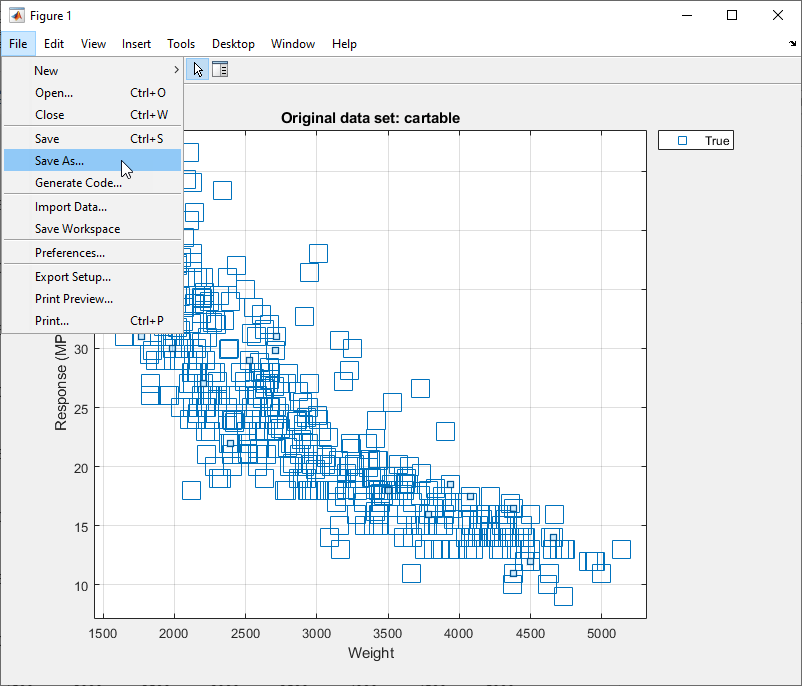
To save the figure, click Save As in the File section of the Figure tab.
To customize the figure, click the Format tab and then click Select & Plot Edit. Right-click the section of the plot that you want to edit. You can change the listed properties, which might include Color, Font, Line Style, and other properties. Or, you can use the Property Inspector to change the figure properties.
As an example, export a response plot in the app to a figure, customize the figure, and save the modified figure.
In the MATLAB Command Window, load the
carbigdata set.load carbig cartable = table(Acceleration,Cylinders,Displacement, ... Horsepower,Model_Year,Weight,Origin,MPG);
Click the Apps tab.
In the Apps section, click the arrow to open the gallery. Under Machine Learning and Deep Learning, click Regression Learner.
On the Learn tab, in the File section, click
 .
.In the New Session from Workspace Data dialog box, select the table
cartablefrom the Data Set Variable list.Click Start Session. Regression Learner creates a response plot of the data by default.
Change the x-axis data in the response plot to
Weight.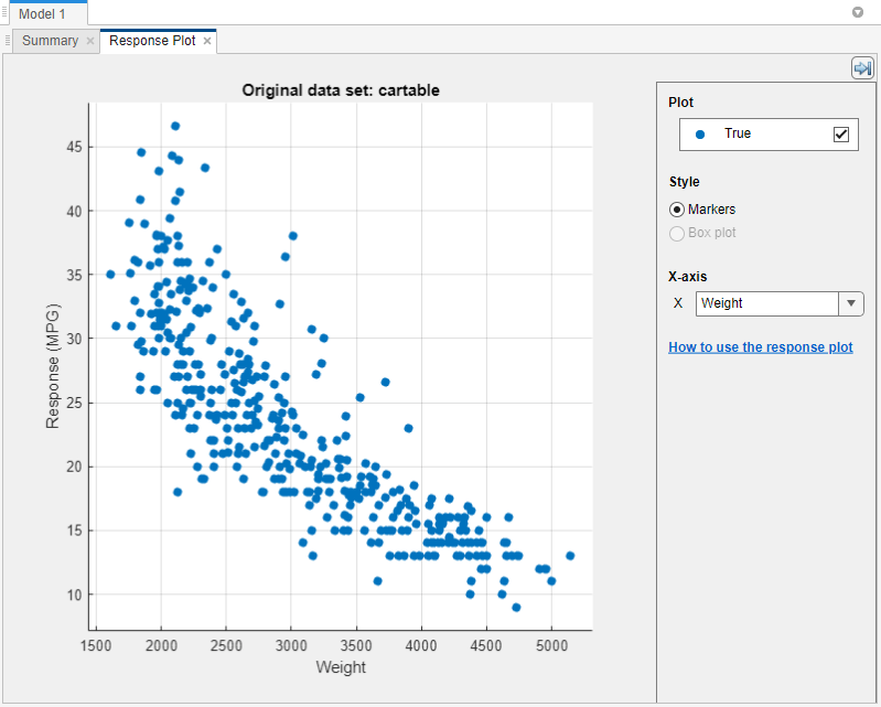
In the Export section of the Learn tab, click Export Plot and select Export Plot to Figure.
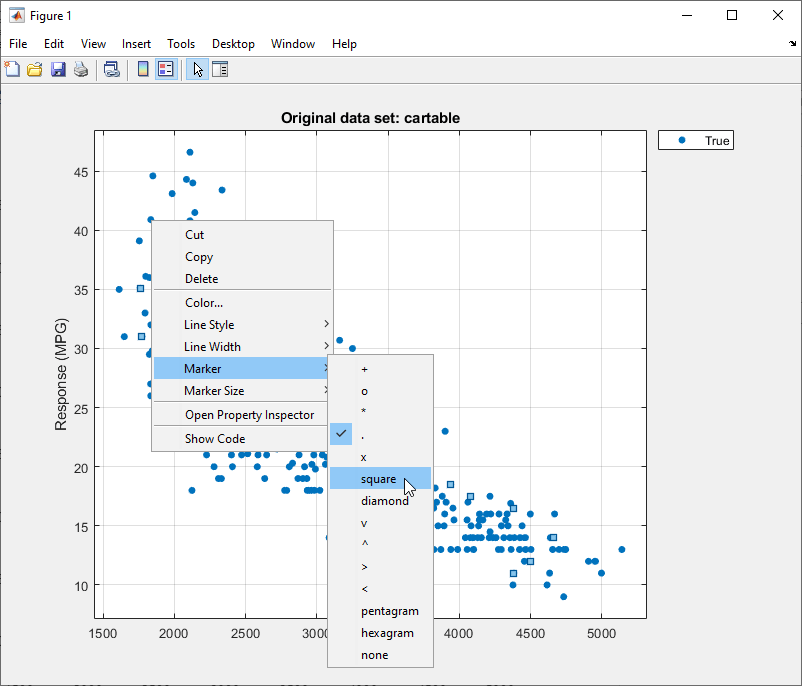
In the new figure, click the Format tab and then click Select & Plot Edit. Right-click a point in the plot. In the context menu, select Marker > square.
To save the figure, click the Figure tab and then click Save As. Select an export format and specify the saved file location and name.