Use Color to Display Information
You can use the plot view to display more information by coloring the plots.
Select View > Plot or click
 .
.Highlight the correct expression in the Output Expressions (Project and Data Set) pane.
Select Color by Value from the right-click menu of the plot.
Select from the pop-up menu the variable you want to use to color the plot.
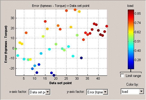
In the following figure, you can see
A plot of the
SumvsData Set Point(this is the strategy from a torque feature calibration).The points are colored by load.
For this example it can be seen that, in general, the higher the load, the higher the value of torque.
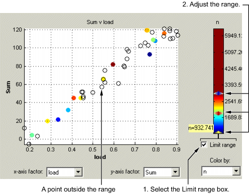
Restricting the Color
You might be interested in only part of the display; for example, you might only be interested in points with a low engine speed. The various display options enable you to color only the points that you are interested in.
To restrict the color,
Select the Limit range box, or right-click the plot and select Limit Color Range.
Three limit markers appear in the color bar. The colors in the color bar are compressed within the limit markers. This increases the range of colors over the range you are interested in (between the limits), making it easier to see the distribution of points.
Adjust the maximum, midpoint, and minimum of the range by dragging the limit markers on the color bar.
Examine the data points and those that are outside the range.
Use the right-click menu to alter the view of the points outside the range:
Select Exclude to remove all points outside the limits from the display.
Select Color Outside Limits to display all points in color, including those outside the limits. Points outside the limits are still colored, but only dark red or dark blue, depending on which end of the range they are.
Select No Color Outside Limits to display the points as in the example shown. Points outside the limits are plotted as empty circles.