Frequency Response Plots for Model Validation
Frequency response plots of a linear model provide insight into the characteristics of the model dynamics, including the frequency of the peak response and stability margins. You can use frequency response plots can help to validate how well a linear parametric model captures the dynamics. The System Identification Toolbox™ provides multiple plotting options.
What Is Frequency Response?
Frequency response plots show the complex values of a transfer function as a function of frequency.
In the case of linear dynamic systems, the transfer function G is essentially an operator that takes the input u of a linear system to the output y:
For a continuous-time system, the transfer function relates the Laplace transforms of the input U(s) and output Y(s):
In this case, the frequency function G(iω) is the transfer function evaluated on the imaginary axis s=iω.
For a discrete-time system sampled with a time interval T, the transfer function relates the Z-transforms of the input U(z) and output Y(z) :
In this case, the frequency function is the transfer function G(z) evaluated on the unit circle. The argument of the frequency function is scaled by the sample time T to make the frequency function periodic with the sampling frequency .
Use Frequency Response to Help Validate Models
The frequency response of a linear dynamic model describes how the model reacts to sinusoidal inputs. If the input u(t) is a sinusoid of a certain frequency, then the output y(t) is also a sinusoid of the same frequency. However, the magnitude of the response is different from the magnitude of the input signal, and the phase of the response is shifted relative to the input signal.
Frequency response plots provide insight into linear systems dynamics, such as frequency-dependent gains, resonances, and phase shifts. Frequency response plots also contain information about controller requirements and achievable bandwidths.
You can use frequency response plots can help to validate how well a linear parametric model, such as a linear ARX mode, a state-space model, or a frequency response model, captures the dynamics. For example, you can estimate a frequency response from the estimation data using spectral analysis (nonparametric model) and then plot the spectral analysis result on top of the frequency response of the parametric models. Because nonparametric and parametric models are derived using different algorithms, agreement between these models increases confidence in the parametric model results. For an example of using spectral analysis to compare models, see Identify Time Series Models at the Command Line.
Options for Frequency-Response Plotting
The System Identification Toolbox provides three frequency-response plotting options.
Linear input-output models and frequency-response data models
bode—Plot the magnitude and phase of the frequency response on a logarithmic frequency scale. A Bode plot consists of two plots. The top plot shows the magnitude by which the transfer function G magnifies the amplitude of the sinusoidal input. The bottom plot shows the phase by which the transfer function shifts the input. The input to the system is a sinusoid, and the output is also a sinusoid with the same frequency.In the System Identification app, use the Frequency resp option in Model Views to create a Bode plot.
nyquist— Plot the imaginary versus real parts of the transfer function. If your model is in a form other than transfer function,nyquistfirst converts the model to a transfer function. You can obtain Nyquist plots only at the command line.
All linear models, including time series (no input) models:
spectrum—Plot the output power spectrum of a time series model or the disturbance spectrum of a linear input-output model. The disturbance spectrum is also called the noise spectrum. This plot is the same as a Bode plot of the model response, but it shows the output power spectrum of the noise model instead. For more information, see Noise Spectrum Plots.In the System Identification app, use the Noise spectrum option in Model Views to create a power spectrum plot.
The figure shows the three types of frequency plot, all generated at the command line.

If you want to customize the appearance of the plot or turn on the confidence region
programmatically, use bodeplot, nyquistplot, or spectrumplot.
For examples and detailed information about each command, see the corresponding reference pages. For information about obtaining frequency response in the System Identification app, see Identify Linear Models Using System Identification App, Plot Bode Plots Using the System Identification App, and Plot the Noise Spectrum Using the System Identification App.
Display the Confidence Interval
In addition to the frequency-response curve, you can display the region that represents the confidence interval on the plot.
To display the confidence interval for a plot generated at the command line, right-click in the plot and select
Characteristics > Confidence
       region
. By default, the plot displays the region for one standard deviation, or 95%. To change the interval, right-click on the plot and selectProperties. Then, in the Options tab of the Property Editor, modify Number of standard deviations to display.To display the confidence interval in the app, select
Options > Show 97%
        confidence intervals
, or for a different size interval, select fromOptions > Set Confidence level.
The confidence interval corresponds to the range of response values with a specific probability of being the actual response of the system. The toolbox uses the estimated uncertainty in the model parameters to calculate confidence intervals and assumes the estimates have a Gaussian distribution.
For example, for a 95% confidence interval, the region around the nominal curve represents the range where there is a 95% chance that it contains the true system response. You can specify the confidence interval as a probability (between 0 and 1) or as the number of standard deviations of a Gaussian distribution. For instance, a probability of 0.99 (99%) corresponds to 2.58 standard deviations.
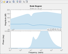
The figure shows an example of the confidence region for a bode plot generated at the command line.

See Also
spectrumplot | spectrum | nyquistplot | nyquist | bodeplot | bode