Combine Line and Bar Charts Using Two y-Axes
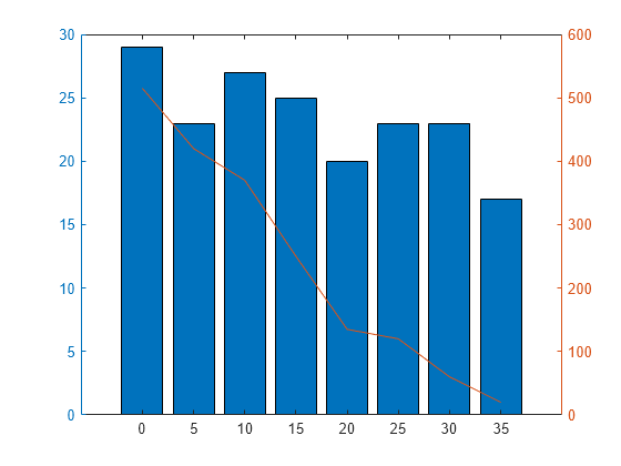
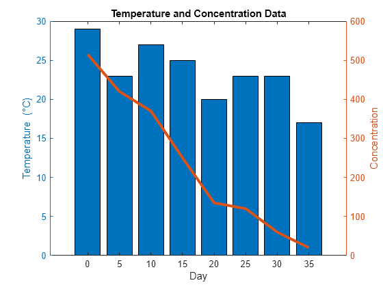
This example shows how to combine a line chart and a bar chart using two different y-axes. It also shows how to customize the line and bars.
Create a chart that has two y-axes using yyaxis. Graphics functions target the active side of the chart. Control the active side using yyaxis. Plot a bar chart using the left y-axis. Plot a line chart using the right y-axis. Assign the bar series object and the chart line object to variables.
days = 0:5:35;
conc = [515 420 370 250 135 120 60 20];
temp = [29 23 27 25 20 23 23 17];

yyaxis left
b = bar(days,temp);
yyaxis right
p = plot(days,conc);

Add a title and axis labels to the chart.
title('Temperature and Concentration Data')
xlabel('Day')
yyaxis left
ylabel('Temperature (\circC)')
yyaxis right
ylabel('Concentration')

Change the width of the chart line and change the bar colors.
p.LineWidth = 3;
b.FaceColor = [ 0 0.447 0.741];
