Visualization of Tall Arrays
Visualizing large data sets requires that the data is summarized, binned, or sampled in
some way to reduce the number of points that are plotted on the screen. In some cases,
functions such as histogram and pie bin the data to
reduce the size, while other functions such as plot and
scatter use a more complex approach that avoids plotting duplicate
pixels on the screen. For problems where the pixel overlap is relevant to the analysis, the
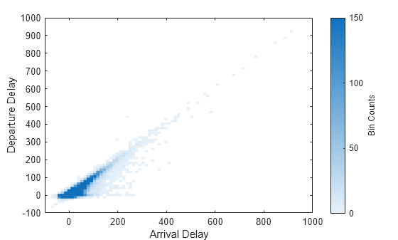
binscatter function also offers an efficient way to visualize density
patterns.
Visualizing tall arrays does not require the use of gather. MATLAB® immediately evaluates and displays visualizations of tall arrays. Currently, you
can visualize tall arrays using the functions and methods in this table.
| Function | Required Toolboxes | Notes |
|---|---|---|
plot | — |
These functions plot in iterations, progressively adding to the plot as more data is read. During the updates, a progress indicator shows the proportion of data that has been plotted. Zooming and panning is supported during the updating process, before the plot is complete. To stop the update process, press the pause button in the progress indicator. |
scatter | — | |
binscatter | — | |
histogram | — | |
histogram2 | — | |
heatmap | — | |
pie | — |
For visualizing categorical data only. |
binScatterPlot (Statistics and Machine Learning Toolbox) | Statistics and Machine Learning Toolbox™ |
Figure contains a slider to control the brightness and color detail in the
image. The slider adjusts the value of the |
ksdensity (Statistics and Machine Learning Toolbox) | Statistics and Machine Learning Toolbox |
Produces a probability density estimate for the data, evaluated at 100 points for univariate data, or 900 points for bivariate data. |
datasample (Statistics and Machine Learning Toolbox) | Statistics and Machine Learning Toolbox |
|
Tall Array Plotting Examples
This example shows several different ways you can visualize tall arrays.
Create a datastore for the airlinesmall.csv data set, which contains rows of airline flight data. Select a subset of the table variables to work with and remove rows that contain missing values.
ds = tabularTextDatastore('airlinesmall.csv','TreatAsMissing','NA');
ds.SelectedVariableNames = {'Year','Month','ArrDelay','DepDelay','Origin','Dest'};
T = tall(ds);
T = rmmissing(T)
T =

  M×6 tall table

    Year    Month    ArrDelay    DepDelay    Origin      Dest
    ____    _____    ________    ________    _______    _______

    1987     10          8          12       {'LAX'}    {'SJC'}
    1987     10          8           1       {'SJC'}    {'BUR'}
    1987     10         21          20       {'SAN'}    {'SMF'}
    1987     10         13          12       {'BUR'}    {'SJC'}
    1987     10          4          -1       {'SMF'}    {'LAX'}
    1987     10         59          63       {'LAX'}    {'SJC'}
    1987     10          3          -2       {'SAN'}    {'SFO'}
    1987     10         11          -1       {'SEA'}    {'LAX'}
     :        :         :           :           :          :
     :        :         :           :           :          :
Pie Chart of Flights by Month
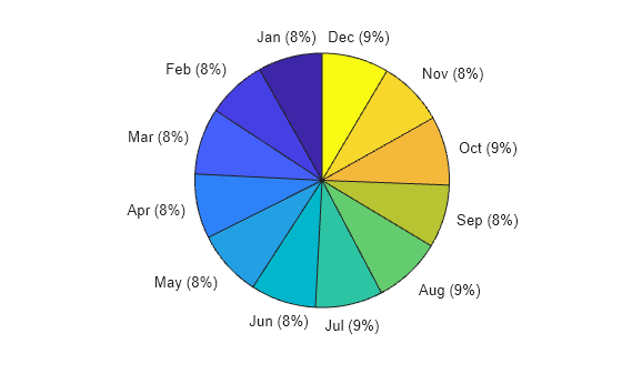
Convert the numeric Month variable into a categorical variable that reflects the name of the month. Then plot a pie chart showing how many flights are in the data for each month of the year.
T.Month = categorical(T.Month,1:12,{'Jan','Feb','Mar','Apr','May','Jun','Jul','Aug','Sep','Oct','Nov','Dec'})T =
M×6 tall table
Year Month ArrDelay DepDelay Origin Dest
____ _____ ________ ________ _______ _______
1987 Oct 8 12 {'LAX'} {'SJC'}
1987 Oct 8 1 {'SJC'} {'BUR'}
1987 Oct 21 20 {'SAN'} {'SMF'}
1987 Oct 13 12 {'BUR'} {'SJC'}
1987 Oct 4 -1 {'SMF'} {'LAX'}
1987 Oct 59 63 {'LAX'} {'SJC'}
1987 Oct 3 -2 {'SAN'} {'SFO'}
1987 Oct 11 -1 {'SEA'} {'LAX'}
: : : : : :
: : : : : :
pie(T.Month)
Evaluating tall expression using the Local MATLAB Session:
- Pass 1 of 2: Completed in 0.51 sec
- Pass 2 of 2: Completed in 0.32 sec
Evaluation completed in 1.1 sec
Histogram of Delays
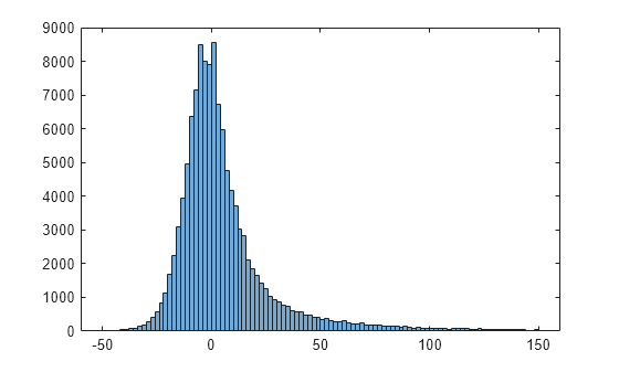
Plot a histogram of the arrival delays for each flight in the data. Since the data has a long tail, limit the plotting area using the BinLimits name-value pair.
histogram(T.ArrDelay,'BinLimits',[-50 150])Evaluating tall expression using the Local MATLAB Session: - Pass 1 of 2: Completed in 0.41 sec - Pass 2 of 2: Completed in 0.3 sec Evaluation completed in 0.91 sec
Scatter Plot of Delays
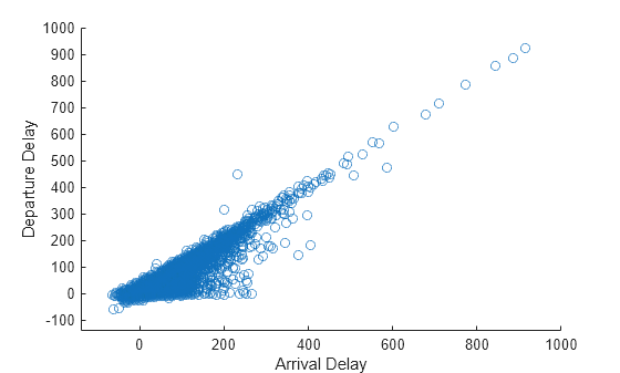
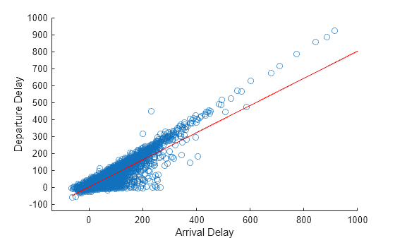
Plot a scatter plot of arrival and departure delays. You can expect a strong correlation between these variables since flights that leave late are also likely to arrive late.
When operating on tall arrays, the plot, scatter, and binscatter functions plot the data in iterations, progressively adding to the plot as more data is read. During the updates the top of the plot has a progress indicator showing how much data has been plotted. Zooming and panning is supported during the updates before the plot is complete.
scatter(T.ArrDelay,T.DepDelay)
xlabel('Arrival Delay')
ylabel('Departure Delay')
xlim([-140 1000])
ylim([-140 1000])
The progress bar also includes a Pause/Resume button. Use the button to stop the plot updates early once enough data is displayed.
Fit Trend Line
Use the polyfit and polyval functions to overlay a linear trend line on the plot of arrival and departure delays.
hold on
p = polyfit(T.ArrDelay,T.DepDelay,1);
x = sort(T.ArrDelay,1);
yp = polyval(p,x);
plot(x,yp,'r-')
hold off
Visualize Density
The scatter plot of points is helpful up to a certain point, but it can be hard to decipher information from the plot if the points overlap extensively. In that case, it helps to visualize the density of points in the plot to spot trends.
Use the binscatter function to visualize the density of points in the plot of arrival and departure delays.
binscatter(T.ArrDelay,T.DepDelay,'XLimits',[-100 1000],'YLimits',[-100 1000])
xlim([-100 1000])
ylim([-100 1000])
xlabel('Arrival Delay')
ylabel('Departure Delay')

Adjust the CLim property of the axes so that all bin values greater than 150 are colored the same. This prevents a few bins with very large values from dominating the plot.
ax = gca;
ax.CLim = [0 150];
