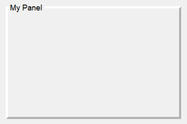
Panel
Panel UI container

Description
A panel UI container groups UI components. Use the Panel object
to modify the appearance and behavior of a panel after you create it.
Creation
Create a panel in an app using the uipanel function.
Properties
Title
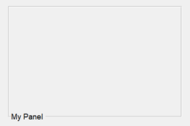
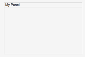
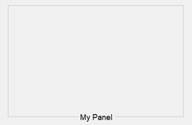
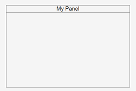
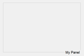
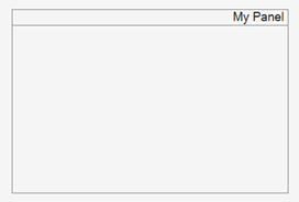
Location of the title, specified as 'lefttop',
'centertop', or 'righttop'.
Color and Styling
Alternatively, you can specify some common colors by name. This table lists the named color options, the equivalent RGB triplets, and hexadecimal color codes.
| Color Name | Short Name | RGB Triplet | Hexadecimal Color Code | Appearance |
|---|---|---|---|---|
"red" | "r" | [1 0 0] | "#FF0000" |
|
"green" | "g" | [0 1 0] | "#00FF00" |
|
"blue" | "b" | [0 0 1] | "#0000FF" |
|
"cyan"
| "c" | [0 1 1] | "#00FFFF" |
|
"magenta" | "m" | [1 0 1] | "#FF00FF" |
|
"yellow" | "y" | [1 1 0] | "#FFFF00" |
|
"black" | "k" | [0 0 0] | "#000000" |
|
"white" | "w" | [1 1 1] | "#FFFFFF" |
|
This table lists the default color palettes for plots in the light and dark themes.
| Palette | Palette Colors |
|---|---|
Before R2025a: Most plots use these colors by default. |
|
|
|
You can get the RGB triplets and hexadecimal color codes for these palettes using the orderedcolors and rgb2hex functions. For example, get the RGB triplets for the "gem" palette and convert them to hexadecimal color codes.
RGB = orderedcolors("gem");
H = rgb2hex(RGB);
Before R2023b: Get the RGB triplets using RGB =
get(groot,"FactoryAxesColorOrder").
Before R2024a: Get the hexadecimal color codes using H =
compose("#%02X%02X%02X",round(RGB*255)).
Background color, specified as an RGB triplet, a hexadecimal color code, or one of the color options listed in the table.
RGB triplets and hexadecimal color codes are useful for specifying custom colors.
An RGB triplet is a three-element row vector whose elements specify the intensities of the red, green, and blue components of the color. The intensities must be in the range
[0,1]; for example,[0.4 0.6 0.7].A hexadecimal color code is a character vector or a string scalar that starts with a hash symbol (
#) followed by three or six hexadecimal digits, which can range from0toF. The values are not case sensitive. Thus, the color codes"#FF8800","#ff8800","#F80", and"#f80"are equivalent.
Alternatively, you can specify some common colors by name. This table lists the named color options, the equivalent RGB triplets, and hexadecimal color codes.
| Color Name | Short Name | RGB Triplet | Hexadecimal Color Code | Appearance |
|---|---|---|---|---|
"red" | "r" | [1 0 0] | "#FF0000" |
|
"green" | "g" | [0 1 0] | "#00FF00" |
|
"blue" | "b" | [0 0 1] | "#0000FF" |
|
"cyan"
| "c" | [0 1 1] | "#00FFFF" |
|
"magenta" | "m" | [1 0 1] | "#FF00FF" |
|
"yellow" | "y" | [1 1 0] | "#FFFF00" |
|
"black" | "k" | [0 0 0] | "#000000" |
|
"white" | "w" | [1 1 1] | "#FFFFFF" |
|
This table lists the default color palettes for plots in the light and dark themes.
| Palette | Palette Colors |
|---|---|
Before R2025a: Most plots use these colors by default. |
|
|
|
You can get the RGB triplets and hexadecimal color codes for these palettes using the orderedcolors and rgb2hex functions. For example, get the RGB triplets for the "gem" palette and convert them to hexadecimal color codes.
RGB = orderedcolors("gem");
H = rgb2hex(RGB);
Before R2023b: Get the RGB triplets using RGB =
get(groot,"FactoryAxesColorOrder").
Before R2024a: Get the hexadecimal color codes using H =
compose("#%02X%02X%02X",round(RGB*255)).
Panel border, specified as 'line' or
'none'.
Border width, specified as a positive integer value. The unit of measurement is pixels.
Border color, specified as an RGB triplet, a hexadecimal color code, or one of the color options listed in the table.
RGB triplets and hexadecimal color codes are useful for specifying custom colors.
An RGB triplet is a three-element row vector whose elements specify the intensities of the red, green, and blue components of the color. The intensities must be in the range
[0,1]; for example,[0.4 0.6 0.7].A hexadecimal color code is a character vector or a string scalar that starts with a hash symbol (
#) followed by three or six hexadecimal digits, which can range from0toF. The values are not case sensitive. Thus, the color codes"#FF8800","#ff8800","#F80", and"#f80"are equivalent.
Alternatively, you can specify some common colors by name. This table lists the named color options, the equivalent RGB triplets, and hexadecimal color codes.
| Color Name | Short Name | RGB Triplet | Hexadecimal Color Code | Appearance |
|---|---|---|---|---|
"red" | "r" | [1 0 0] | "#FF0000" |
|
"green" | "g" | [0 1 0] | "#00FF00" |
|
"blue" | "b" | [0 0 1] | "#0000FF" |
|
"cyan"
| "c" | [0 1 1] | "#00FFFF" |
|
"magenta" | "m" | [1 0 1] | "#FF00FF" |
|
"yellow" | "y" | [1 1 0] | "#FFFF00" |
|
"black" | "k" | [0 0 0] | "#000000" |
|
"white" | "w" | [1 1 1] | "#FFFFFF" |
|
This table lists the default color palettes for plots in the light and dark themes.
| Palette | Palette Colors |
|---|---|
Before R2025a: Most plots use these colors by default. |
|
|
|
You can get the RGB triplets and hexadecimal color codes for these palettes using the orderedcolors and rgb2hex functions. For example, get the RGB triplets for the "gem" palette and convert them to hexadecimal color codes.
RGB = orderedcolors("gem");
H = rgb2hex(RGB);
Before R2023b: Get the RGB triplets using RGB =
get(groot,"FactoryAxesColorOrder").
Before R2024a: Get the hexadecimal color codes using H =
compose("#%02X%02X%02X",round(RGB*255)).
Font
Font name, specified as a system supported font name. The default font depends on the specific operating system and locale.
If the specified font is not available, then MATLAB uses the best match among the fonts available on the system where the app is running.
Example: 'Arial'
Interactivity
State of visibility, specified as 'on' or 'off',
or as numeric or logical 1 (true) or
0 (false). A value of 'on'
is equivalent to true, and 'off' is equivalent to
false. Thus, you can use the value of this property as a logical
value. The value is stored as an on/off logical value of type matlab.lang.OnOffSwitchState.
'on'— Display the object.'off'— Hide the object without deleting it. You still can access the properties of an invisible UI component.
To make your app start faster, set the Visible property to
'off' for all components that do not need to appear at
startup.
Changing the size of an invisible container triggers the
SizeChangedFcn callback when it becomes visible.
Changing the Visible property of a container does
not change the values of the Visible
properties of child components. This is true even though hiding the container causes the
child components to be hidden.
Operational state, specified as 'on' or
'off', or as numeric or logical 1
(true) or 0 (false). A
value of 'on' is equivalent to true, and
'off' is equivalent to false. Thus, you can
use the value of this property as a logical value. The value is stored as an on/off
logical value of type matlab.lang.OnOffSwitchState.
If you set this property to
'on', the app user can interact with the component.If you set this property to
'off', the component appears dimmed, indicating that the app user cannot interact with it, and that it will not trigger a callback.
Changing the value of the Enable property for a panel does
not change the value of the Enable
property for UI components contained within that panel.
Tooltip, specified as a character vector, cell array of character vectors, string array, or 1-D categorical array. Use this property to display a message when the user hovers the pointer over the component at run time. The tooltip displays even when the component is disabled. To display multiple lines of text, specify a cell array of character vectors or a string array. Each element in the array becomes a separate line of text. If you specify this property as a categorical array, MATLAB uses the values in the array, not the full set of categories.
Context menu, specified as a ContextMenu object created using the uicontextmenu function. Use this property to display a context menu when
you right-click on a component.
Position
This property is read-only.
Location and size of the panel, excluding borders and title, returned as a
four-element vector of the form [left bottom width height]. This
table describes each element in the vector.
| Value | Description |
|---|---|
left | Distance from the inner left edge of the parent container to the inner left edge of the panel. |
bottom | Distance from the inner bottom edge of the parent container to the inner bottom edge of the panel. |
width | Distance between the inner edges of the panel’s right and left borders. |
height | Distance between the inner edges of the panel’s top and bottom borders. This distance excludes the title, if it exists. |
All measurements are in units specified by the
Units property.
Note
These are some important points to consider when using the
InnerPosition property:
InnerPositionvalues are affected by the presence (or absence) of a title, the font characteristics, and theBorderType.InnerPositionvalues are relative to the parent container’s drawable area. The drawable area is the area inside the borders of the container and does not include the area occupied by the title.
Location and size of the panel, including borders and title, specified as a
four-element vector of the form [left bottom width height]. All
measurements are in units specified by the Units property.
This property value is identical to the Position property
value.
Units of measurement, specified as one of the values in this table.
| Units Value | Description |
|---|---|
'pixels' (default in uifigure-based apps) | On Windows and Macintosh systems, the size of a pixel is 1/96th of an inch. This size is independent of your system resolution. On Linux systems, the size of a pixel is determined by your system resolution. |
'normalized' (default in figure-based apps) | These units are normalized with respect to the parent container. The lower-left corner of the container maps to |
'inches' | Inches. |
'centimeters' | Centimeters. |
'points' | Points. One point equals 1/72nd of an inch. |
'characters' | These units are based on the default uicontrol font of the graphics root object:
To access the default uicontrol font, use |
The recommended value is 'pixels', because most MATLAB app building functionality measures distances in pixels. You can create an
object that rescales based on the size of the parent container by parenting the object
to a grid layout manager created using the uigridlayout function. For more information, see Lay Out Apps Programmatically.
Automatically resize children, specified as 'on' or
'off', or as numeric or logical 1
(true) or 0 (false). A
value of 'on' is equivalent to true, and
'off' is equivalent to false. Thus, you can
use the value of this property as a logical value. The value is stored as an on/off
logical value of type matlab.lang.OnOffSwitchState.
'on'— Child components automatically resize when the container resizes. This value is the default value for panels in figures created using theuifigurefunction.'off'— Child components do not resize. This value is the default value for panels in figures created using thefigurefunction.
The AutoResizeChildren property affects direct
children of the container, not children inside nested containers.
To customize the resize behavior, set the AutoResizeChildren
property to 'off' and create a SizeChangedFcn
callback for the container. For more information, see Manage App Resize Behavior Programmatically.
To disable resizing of an app, set the Resize property of the
figure to 'off'.
It is recommended to specify AutoResizeChildren as
'on' only in apps that are laid out using pixel units. Enabling
automatic resizing in apps that are laid out using non-pixel units might cause
unexpected behavior.
Layout options, specified as a
GridLayoutOptions object. This property specifies options for
components that are children of grid layout containers. If the component is not a
child of a grid layout container (for example, it is a child of a figure or panel),
then this property is empty and has no effect. However, if the component is a child of
a grid layout container, you can place the component in the desired row and column of
the grid by setting the Row and Column
properties on the GridLayoutOptions object.
For example, this code places a panel in the third row and second column of its parent grid.
g = uigridlayout([4 3]);
p = uipanel(g);
p.Layout.Row = 3;
p.Layout.Column = 2;
To make the panel span multiple rows or columns, specify the
Row or Column property as a two-element
vector. For example, this panel spans columns 2 through
3:
p.Layout.Column = [2 3];
Callbacks
Size change callback, specified as one of these values:
A function handle.
A cell array in which the first element is a function handle. Subsequent elements in the cell array are the arguments to pass to the callback function.
A character vector containing a valid MATLAB expression (not recommended). MATLAB evaluates this expression in the base workspace.
Define this callback to customize the app layout when the size of this container
changes (e.g., when the user resizes the window). In it, write code to adjust the
Position property of the child components.
Note
The SizeChangedFcn callback will not execute unless the
AutoResizeChildren property of this container is set to
'off'. In App Designer, you can make the
SizeChangedFcn executable by selecting the container and
clearing the AutoResizeChildren check box in the component tab
of the Component Browser.
The SizeChangedFcn callback executes when:
This container becomes visible for the first time.
This container is visible while its size changes.
This container becomes visible for the first time after its size changes. This situation occurs when the size changes while the container is invisible, and then it becomes visible later.
Other important points to consider when defining a
SizeChangedFcn callback:
Consider delaying the display of this container until after all the variables that the
SizeChangedFcnuses are defined. This practice can prevent theSizeChangedFcncallback from returning an error. To delay the display of the container, set itsVisibleproperty to'off'. Then, set theVisibleproperty to'on'after you define the variables that yourSizeChangedFcncallback uses.If your app contains nested containers, they resize from the inside out.
To access the container that is resizing from within the
SizeChangedFcn, refer to the source object (the first input argument in the callback) or use thegcbofunction.
Alternate ways to specify resize behavior are to create a
GridLayout object or use the auto-reflow options in App Designer.
These options can be easier to use than SizeChangedFcn callbacks.
However, there are some advantages that SizeChangedFcn callbacks
have over these options. For example:
Resizing a component up to a minimum or maximum size that you define.
Implementing non-linear resize behaviors.
Callback Execution Control
Ability to become current object, specified as
'on' or 'off', or as numeric or logical
1 (true) or 0
(false). A value of 'on' is equivalent to
true, and 'off' is equivalent to
false. Thus, you can use the value of this property as a logical
value. The value is stored as an on/off logical value of type matlab.lang.OnOffSwitchState.
'on'— Sets the current object to thePanelwhen the user clicks the component in the running app. Both theCurrentObjectproperty of theFigureand thegcofunction return thePanelas the current object.'off'— Sets the current object to be the closest ancestor of thePanelwhoseHitTestis'on'when the user clicks the component in the running app.
Parent/Child
Parent container, specified as a Figure object
or one of its child containers: Tab, Panel, ButtonGroup, or
GridLayout. If no container is specified,
MATLAB calls the figure function to create a new Figure object that serves as the parent container.
Panel child objects, returned as an empty
GraphicsPlaceholder or a 1-D array of component objects. The
children of a Panel can be any component object,
including another Panel.
You cannot add or remove child components using the Children
property. Use this property to view the list of children or to reorder the children.
The order of the child objects in this array reflects the front-to-back stacking order
of the components on the screen.
To add a child object to this list, set the Parent property of
the child object to the Panel object.
Identifiers
This property is read-only.
Type of graphics object, returned as 'uipanel'.
Object Functions
scroll | Scroll to location within UI component |
isInScrollView | Determine if component is visible in scrollable container |
Examples
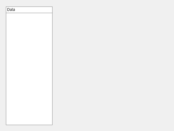
Create a panel in a UI figure, and customize its appearance by specifying property values.
fig = uifigure;
p = uipanel(fig, ...
    "Title","Data", ...
    "BackgroundColor","white");
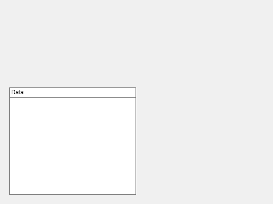
Determine the panel location and size.
s = p.Position
s = 1×4

    20    20   260   221
Update the width and height of the panel by modifying the third and fourth elements of the panel Position property.
p.Position(3:4) = [150 380];
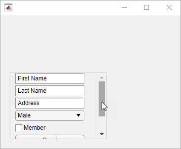
Create a panel in a UI figure. Add six UI components to the panel. The first two components are not visible because they lie outside the upper border of the panel.
fig = uifigure;
p = uipanel(fig,"Position",[20 20 196 135]);
ef1 = uieditfield(p,"Text","Position",[11 165 140 22],"Value","First Name");
ef2 = uieditfield(p,"Text","Position",[11 140 140 22],"Value","Last Name");
ef3 = uieditfield(p,"Text","Position",[11 115 140 22],"Value","Address");
dd = uidropdown(p,"Position",[11 90 140 22],"Items",["Male","Female"]);
cb = uicheckbox(p,"Position",[11 65 140 22],"Text","Member");
btn = uibutton(p,"Position",[11 40 140 22],"Text","Send");

Enable scrolling in the panel by setting the Scrollable
property to "on". By default, the scroll bar is scrolled to the top
of the panel.
p.Scrollable = "on";
Version History
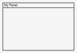
Introduced before R2006aPanels created in apps created using the figure function have an
updated appearance. Because of this update, certain title and border options have
changed.
TitlePosition PropertyPanel titles can appear only at the top of panels. As a result, these
TitlePosition values have changes in behavior.
| Value | R2024b and Earlier | Starting in R2025a | Recommended Value |
|---|---|---|---|
'leftbottom' |
|
| Update your code to use 'lefttop' instead
of'leftbottom' to reflect the panel title position. |
'centerbottom' |
|
| Update your code to use 'centertop' instead
of'centerbottom' to reflect the panel title position. |
'rightbottom' |
|
| Update your code to use 'righttop' instead
of'rightbottom' to reflect the panel title position. |
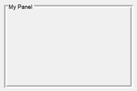
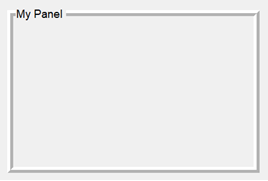
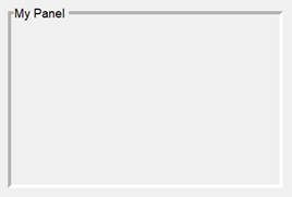
BorderType PropertyVisible panel borders always appear as a line. As a result, some
BorderType values have changes in behavior. Specifying
BorderType as any of the values in the table causes a warning.
Additionally, the default BorderType value has changed from
'etchedin' to 'line'.
| Value | R2024b | R2025a | Recommended Value |
|---|---|---|---|
'etchedin' |
|
| Update your code to use 'line' instead of
'etchedin' to reflect the panel border type. |
'etchedout' |
|
| Update your code to use 'line' instead of
'etchedout' to reflect the panel border type. |
'beveledin' |
|
| Update your code to use 'line' instead of
'beveledin' to reflect the panel border type. |
'beveledout' |
|
| Update your code to use 'line' instead of
'beveledout' to reflect the panel border type. |
ShadowColor PropertyAs a result of the changes to the BorderType property, the
ShadowColor property has no effect and warns if you set it. To
specify the border color of a panel, use the BorderColor property
instead.
The ShadowColor property no longer appears in the list returned
by calling the get function on a Panel
object.