Rotary Switch
Change parameter or variable value using rotary switch with customizable appearance
Since R2021b
Libraries:
Simulink /
Dashboard /
Customizable Blocks
Description
Use the Rotary Switch block to change the value of the connected variable or parameter before or during simulation. When you use the Rotary Switch block in the Customizable Blocks library, you can customize the appearance of the block to look like a real rotary switch in your system. Use the Rotary Switch block with other dashboard blocks to create an interactive dashboard for your model.
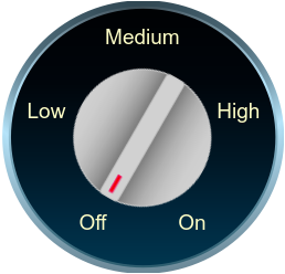
A real rotary switch has multiple settings. The Rotary Switch block treats these settings as different states. A state pairs a state value with a handle orientation, a click area, and a state label that is displayed on the click area.
To activate a state during simulation, click the click area of the state or drag the handle to point to the click area. To activate a state when the simulation is not running, click the Rotary Switch block to select the block, and then click the click area or drag the handle to point to the click area. When you activate the state, the state value is assigned to the Simulink® block diagram element to which the Rotary Switch block connects.
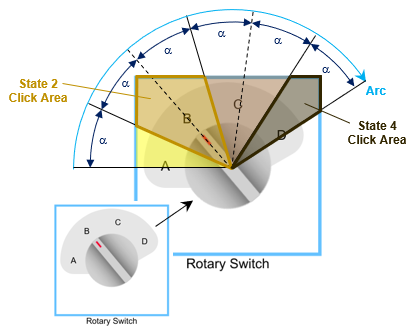
Collectively, the state click areas cover the area of the block within the angular range that the handle traverses when it moves from the first state to the last state. The state labels are evenly spaced over the range, with the first label at the start of the range and the last label at the end of the range. The range is subdivided into click areas such that the borders of adjacent click areas bisect the angular distance between labels.
Note
Double-clicking a connected Rotary Switch block during simulation or after clicking the block does not open the Block Parameters dialog box. To open the Block Parameters dialog box, press Shift, then double-click the block.
Clicking a connected Rotary Switch block during simulation both selects the block and moves the switch handle. To select the block without moving the switch handle, press Shift, then click the block.
Customize Rotary Switch Blocks
When you add a Rotary Switch block to your model, the block is preconfigured with a default design. You can use the block with the default design or customize the appearance of the block.
To customize the appearance of the block, use design mode. After selecting the block, you can enter design mode in one of three ways:
In the Simulink Toolstrip, on the block-specific tab, under Design, click Edit.
In the Property Inspector, on the Design tab, click Edit.
Pause on the ellipsis that appears over the block and click the Edit Custom Block button
 .
.
In design mode, you can use the toolbar above the block to customize the rotary switch. To access additional customization options or to enter exact values for design settings, use the Design tab in the Property Inspector.
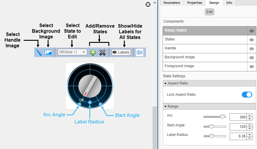
When you customize a Rotary Switch block, you configure the block
appearance for each state. To select a state to customize, use the drop-down list in the
toolbar. Alternatively, on the Design tab, select the
States component and then select from the Select
State list. To add a state, in the toolbar, click the Add State button
 . To delete a state, click the Remove State button
 .
.
Design Mode Actions that Customize the Selected State
| Action | Available in Toolbar | Available in Design Tab |
|---|---|---|
Specify the state value. | No | Yes |
Specify the state label text. | No | Yes |
| Add or remove states. | Yes | Yes |
Upload a handle image. | Yes | Yes |
Change the size of the handle. | No | Yes |
Change the position the handle. | No | Yes |
In addition to customizing the block design using the toolbar and Design tab, you can also resize and reposition components interactively in the canvas. The movement of the handle is limited to the line that passes through the center of the block at the Start Angle.
To change the color of the state labels, on the Format tab, under
Style, click the arrow on the Foreground
button and select a color. You can select from a palette of standard colors or click the
Custom Colors button  to specify a custom color.
Design Mode Actions that Apply to All States
| Action | Available in Toolbar | Available in Design Tab |
|---|---|---|
Change the arc length spanned by the state labels. | No | Yes, in the Rotary Switch component |
Change the start angle of the arc. | No | Yes, in the Rotary Switch component |
Change the label radius. | No | Yes, in the Rotary Switch component |
Upload a background image. | Yes | Yes |
Set a solid background color. | No | Yes |
Upload a foreground image. | No | Yes |
When you finish editing the design, to exit design mode, click the X in the upper right of the canvas.
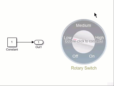
Connect Dashboard Blocks
Dashboard blocks do not use ports to connect to model elements. To connect a dashboard
block, use connect mode. To enter connect mode on an unconnected block, pause on the block
you want to connect and click the Connect button  . To enter connect mode on a connected block, select the
block, pause on the ellipsis that appears (…), and in the action menu that expands, click
the Connect button.
. To enter connect mode on a connected block, select the
block, pause on the ellipsis that appears (…), and in the action menu that expands, click
the Connect button.
To connect a control block to a parameter in your model or to change the connection of a
control block, enter connect mode. Select the block to whose parameter you want to connect.
From the list that appears, select the parameter to which you want to connect. Then, pause
on the dashboard block and click the Done Connecting button .
The control block cannot connect to a parameter whose value is a variable until you update the model diagram. To connect to a parameter whose value is a variable or to modify the value of a variable that is the value of a connected parameter when the simulation is not running, update the model diagram by pressing Ctrl+D.
You can connect to a parameter with a scalar value or to an element of a matrix or structure. For more information, see Connect Dashboard Blocks to Simulink Model.
You can also connect dashboard blocks to a Stateflow® chart. For more information, see Connect Dashboard Blocks to Stateflow (Stateflow).
This animation shows how to connect the Rotary Switch block to your model.
Parameter Logging
Tunable parameters connected to dashboard blocks are logged to the Simulation Data
Inspector, where you can view the parameter values along with logged signal data. You can
access logged parameter data in the MATLAB® workspace by exporting the parameter data from the Simulation Data Inspector
by using the UI or the Simulink.sdi.exportRun function. For more information about exporting
data using the Simulation Data Inspector UI, see Export Data From Simulation Data Inspector to Workspace or File. The
parameter data is stored in a Simulink.SimulationData.Parameter object, accessible as an element in the
exported Simulink.SimulationData.Dataset.
Examples

Design Custom Rotary Switches
Design rotary switches using the customizable Rotary Switch block.
Limitations
Except for the Dashboard Scope block and the Display block, dashboard blocks can only connect to real scalar signals.
You cannot use the Connection table in the Block Parameters dialog box to connect a dashboard block to a block that is commented out. When you connect a dashboard block to a commented block using connect mode, the dashboard block does not display the connected value until the you uncomment the block.
Dashboard blocks cannot connect to model elements inside referenced models.
When you simulate a model hierarchy, dashboard blocks inside referenced models do not update.
Dashboard blocks do not support rapid accelerator simulation.
When you connect a dashboard block to a variable or parameter during simulation, the data for that variable or parameter is not logged to the Simulation Data Inspector. To log variable and parameter data to the Simulation Data Inspector, connect the dashboard block to the variable or parameter prior to simulation.
When you simulate a model in external mode with the Default parameter behavior set to Inlined, dashboard blocks can appear to change parameter and variable values. However, the change does not propagate to the simulation. For example, Gain blocks display changes made to the Gain parameter using the dashboard blocks, but the Gain value used in the simulation does not change.
Parameters
Block Characteristics
Data Types |
|
Direct Feedthrough |
|
Multidimensional Signals |
|
Variable-Size Signals |
|
Zero-Crossing Detection |
|
Tips
The Rotary Switch block allows you to design a circular control, with the state labels and the click areas that cause state transitions distributed along an arc. For more flexibility in the design of a control block with several states, use one of the customizable switch blocks. Each block is preconfigured with two states, but you can add and configure any number of states as required by your design.
To design a control that applies values to a connected variable or parameter from a continuous range, use the Knob, Horizontal Slider, or Vertical Slider blocks.
Extended Capabilities
Version History
Introduced in R2021bStarting in R2023b, you can open a dashboard panel in a new window. To do so, select the
panel and pause on the ellipsis that appears. In the action menu that expands, click Open In
New Window  .
.
You can minimize and restore the new window containing the panel separately from the model window. From the panel window, you can run, pause, stop, and step through the simulation. In the panel window, you can edit the panel and the blocks it contains.
To return the panel to the model canvas, in the panel window toolstrip, click Open in
canvas  .
.
For more information about opening a panel in a new window, see Open Panels in New Window.
See Also
Blocks
- Customizable Rocker Switch | Customizable Slider Switch | Customizable Toggle Switch | Rocker Switch | Rotary Switch | Slider Switch | Toggle Switch