Results for
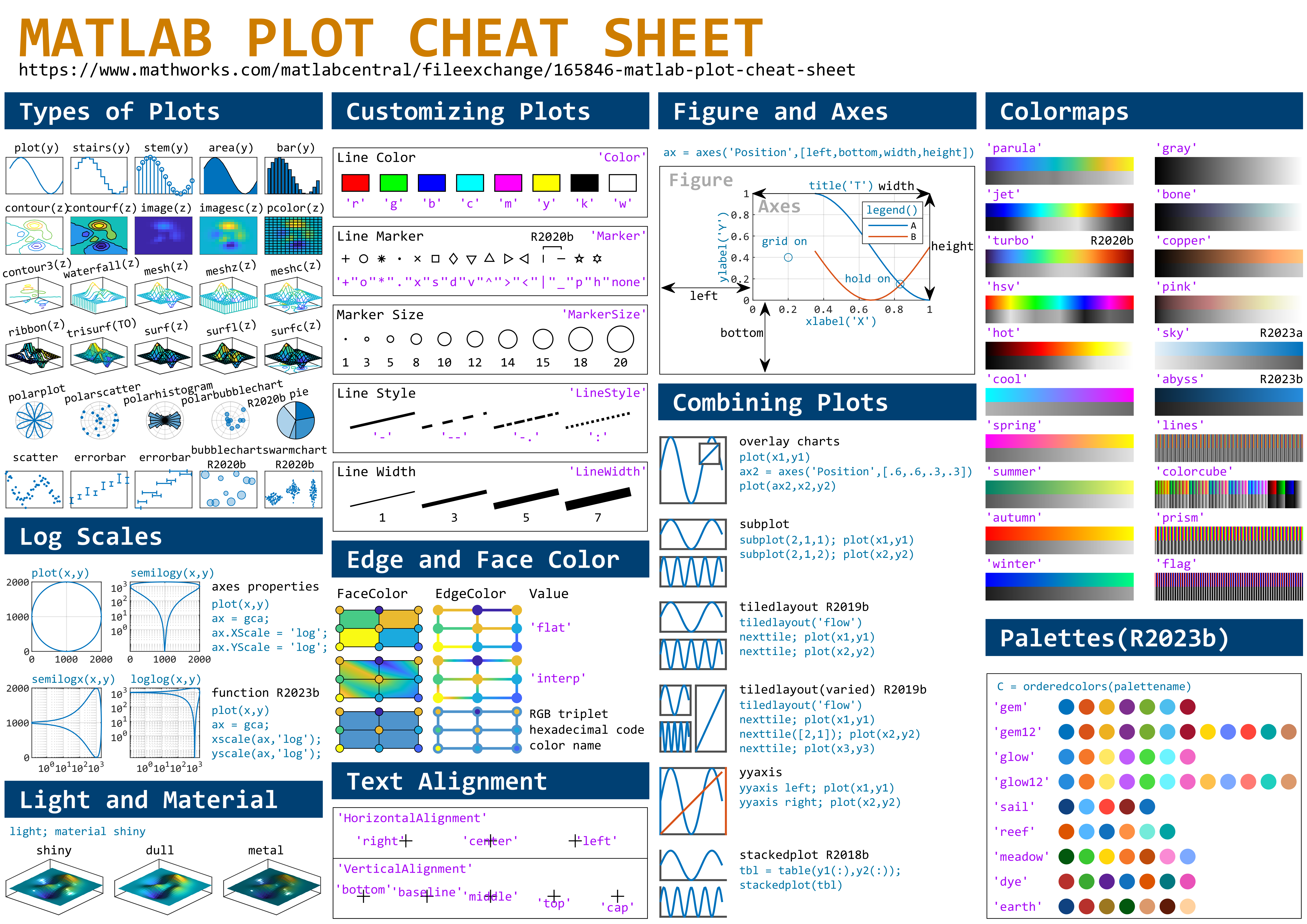
This cheat sheet is here:
reference:
- https://github.com/peijin94/matlabPlotCheatsheet
- https://github.com/mathworks/visualization-cheat-sheet
- https://www.mathworks.com/products/matlab/plot-gallery.html
- https://www.mathworks.com/help/matlab/release-notes.html
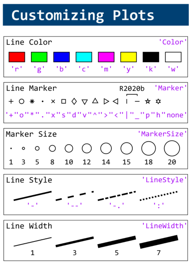
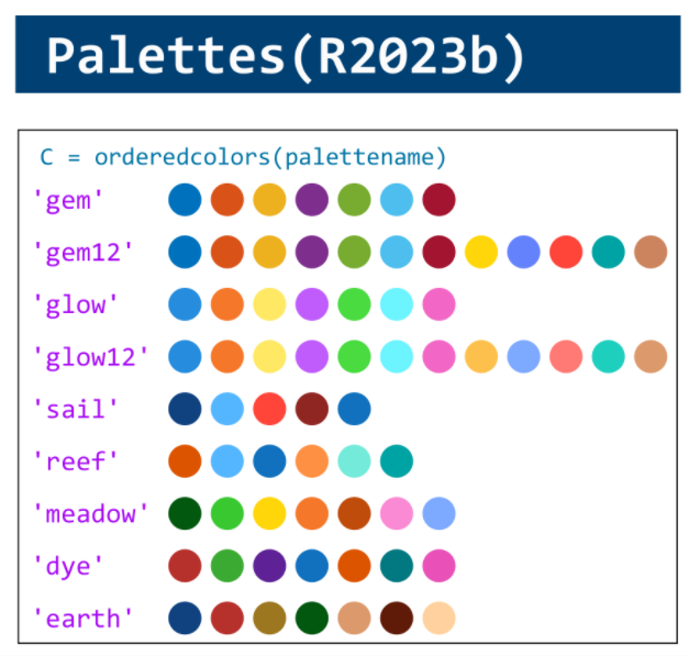
MATLAB used to have official visualization-cheat-sheet, but there have been quite a few new updates in MATLAB versions recently. Therefore, I made my own cheat sheet and marked the versions of each new thing that were released :
'
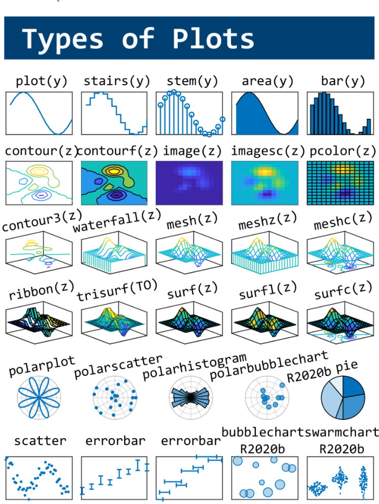
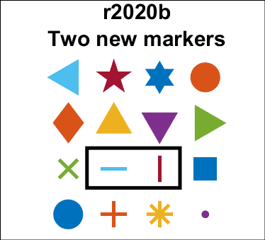
The Matlab r2020b release introduces the new horizontal ('_') and vertical (' | ') line marker symbols that are centered around the coordinate similarly to the plus marker ('+').
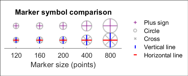
plot(x,y,'_')
plot(x,y,'|')
See the attached Live Script to reproduce all plots in this post.
'
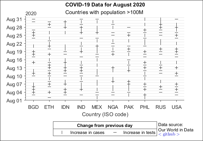
Use case example 1: Days in August 2020 that COVID-19 cases (vertical ticks) and number of tests (horizontal ticks) increased from the previous day in countries with populations greater than 100M (4 countries eliminated for incomplete data).
'
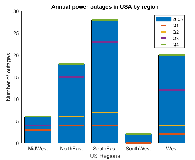
Use case example 2: (An alternative to stacked bar plots) Number of power outages in 2005 across regions of the USA, broken down by calendar quarters.